Logo Design
Truth Montessori
Public Charter School
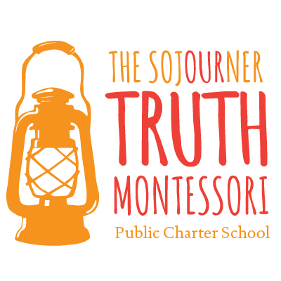
The Sojourner Truth Montessori Public Charter School was looking for a logo that clearly articulated who they are, what type of school they were building and why their model works for families. Those ambitions, combined with a mouthful of a name, directed our creative process as we winnowed the choices down to a precise and clean logo.
Categories
Logo Design
Brand Identity
The Creative Process
We start every new logo project with a long conversation about the mission of your organization and the audience(s) that you want to capture. Then begins a deep dive into research and visual brainstorming.
A variety of options
We take some time to digest our research, put pen to paper, and emerge with an array of 8 to 10 logo concepts to discuss, whittle down and refine to a top few.
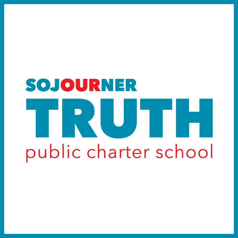
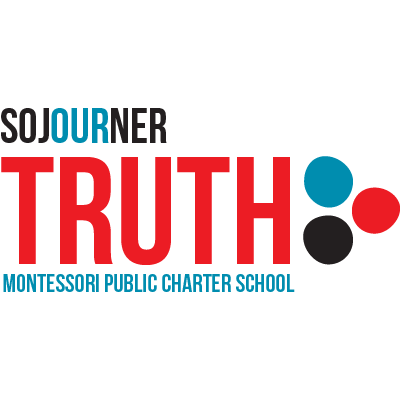
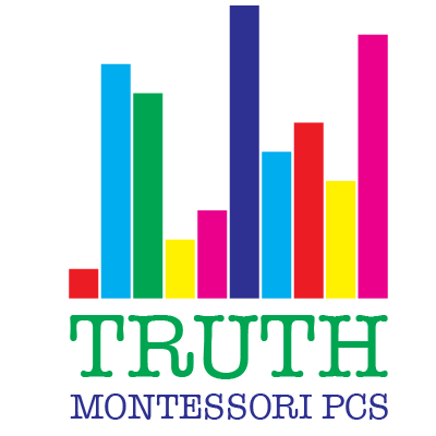
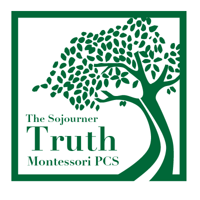
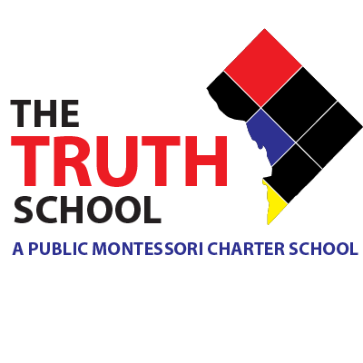
Here you can see a few of the first concepts for Truth Montessori.
Method to the madness
You’ll see in the examples above that each concept spoke to a different facet that was important to the school: the Montessori method, their name-sake, Sojourner Truth, the 3 dots representing teacher, student and community.
As we revised the top choices, it was important to the school to simplifiy and essentialize, using bold color to put the name front and center.
We are big fans of Merry’s Design work. The logo is great, exactly what we were hoping for.
– Founding Executive Director, Truth School